The first thing that your customers notice about your restaurant is the way you’ve branded it. Restaurant branding includes your restaurant logo and the way your restaurant name is displayed. It gives customers the first impression of your restaurant, and more often than not, it is the last impression. Thus, getting the right restaurant logo becomes an inevitable part of scaling up your business.
While establishing your brand, or refreshing your existing logo, you must be able to think of a design that conveniently represents your values. The first step while creating a restaurant logo or having it made by a designer is identifying the message you want to deliver through it. The font, colors, and text together are then determined by your restaurant format.
In this blog article, we cover:
- Factors that contribute to an ideal restaurant logo
- Top 10 creative restaurant logos handpicked for your inspiration
Qualities You Should Look For While Creating Your Restaurant Logo
Here are some essentials that you need to consider while designing/redesigning your restaurant logo.
1. Clarity
Your restaurant logo needs to deliver an immediate sense of what your brand is. Ensure that your logo is kept simple, clean and uncluttered. This way, you can scale it, or use it on multiple channels without distorting it.
2. Scalability:
The next important thing you need to consider while designing a restaurant logo is scalability. Since your restaurant logo will go live on multiple media channels, you need to have minimum details and design grids so that it’s not stretched or distorted when you enlarge or shrink it.
3. Adaptability
As your brand grows, you’re going to use your logo in multiple ways. From your restaurant merchandise to the delivery packets, all of them are going to have your restaurant logo. You want to make sure that all your logo packs are just as evident in black and white as they are in color.
4. Memorability
Now, this is the most critical factor. Since your logo is what your customers identify you with, it needs to be memorable. You must relate it to your restaurant’s name and theme so that it is easy to recall without much effort. The best way you can do that is to be unique. Choose shapes and combinations that haven’t been used earlier and are not similar to any other brand.
Restaurant Logos For Your Inspiration!
Here are the top 10 restaurant logo designs that we picked for you.
1. Nelmare Sushi
Top on the list, we have a logo from the Nelmare Sushi. A minimal design that delivers the brand’s specialty.
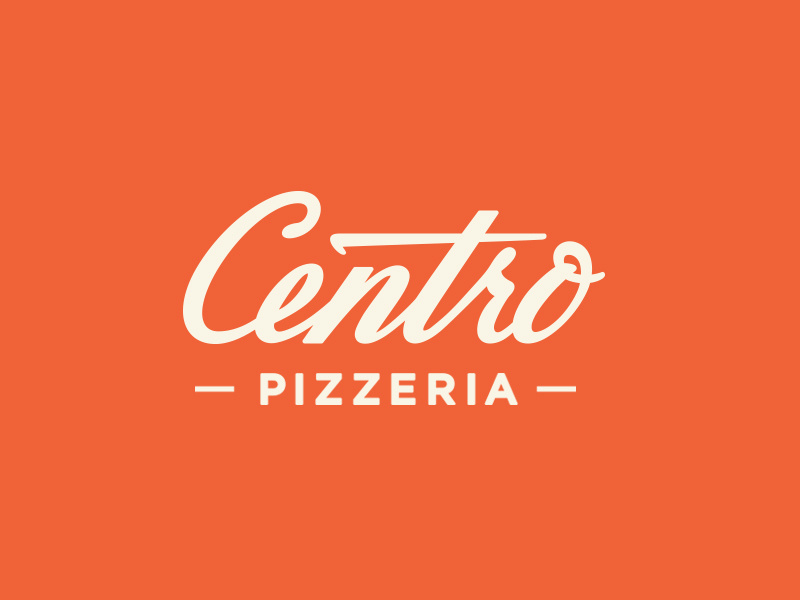
2. Centro Pizzeria
A brilliant contrast of orange and white, Centro Pizzeria uses a simple font to create their logo. Simple yet effective.
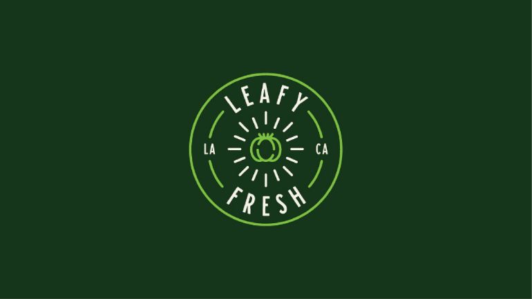
3. Leafy Fresh
The bold use of shades of green makes customers expect precisely what the brand delivers.
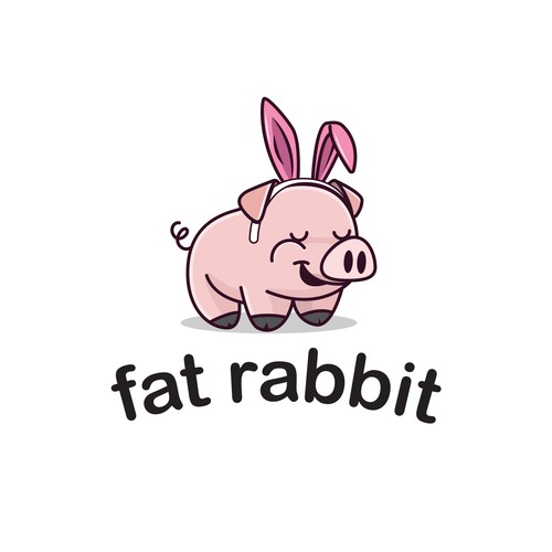
4. Fat Rabbit Bar and Grill
Next on the list, we have our restaurant logo from Fat Rabbit and Grill. The minimal colors and the cute graphics make it both impactful and memorable for the customers.
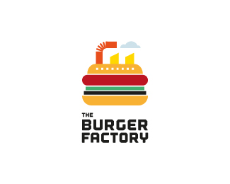
5. The Burger Factory
The logo delivers a clear message of its name. It is easily identifiable and gives a sense of fun at your restaurant.
6. Cooper Burgers
The black and white theme of the logo compliments the graphics and gives it a fun element.
7. Mister Cooper
What Mister Cooper did with their logo is quite impressive. The creative Typeform does not confuse the consumers and is pretty easy to read. An exciting part of the logo lies in the hidden ‘Ice Cream’ hidden between the name of the restaurant. Customers thereby know exactly what to expect, and are pretty intrigued by the creativity!
8. Taco Republica
The colors and Typeform go pretty well with the classic theme of the restaurant. It’s both effective and memorable for customers.
9. Wendy’s
The girl in the logo appeals to families and groups with a smile. We loved how the designer only used contrasting colors to complete the entire graphic. The girl in the logo is also easily memorable.
10. Moonshine Bar and Restaurant
With the subtle choice of color and minimal graphics, the restaurant logo from Moonshine bar and restaurant does justice to its theme.
All in all, creating restaurant logos can be quite a brain scratcher. To have your brand theme delivered right, present it in the simplest way possible. Also, the scalability and adaptability of your restaurant logo are two significant factors to consider to get the right logo for your brand.


