Restaurant marketing and customer psychology go hand in hand especially when it comes to things like packages, placing and menus. Menus are the silent salesmen of your restaurant and the way you place dishes, prices, use colors or graphics can make your customers order more. While there are many tricks in the book when it comes to restaurant menu design, there are not too many people talking about who the trick works on and how your restaurant will profit from menu engineering. That is where we introduce the customer’s point of view in the game!
Restaurant Menu Design: How To Use Menu Psychology
While most psychological tricks used in restaurant menu designing focus on selling dishes with maximum profits to customers, not all of them are straight jacket solutions. They mostly leave scope for innovation depending on customer profile and demography. Read on to know how you can use your restaurant menu to tempt customers and how you can innovate on these techniques based on your customer base just like a menu engineer would.
1. Know your Audience
The best way to engineer a great restaurant menu design is to know who will be ordering and how they think. Turn to your restaurant POS and look at what your customers order, which age group they fall in and how much do they typically like to spend. Gathering this information may seem redundant but is very important as it will help you set up decoys and utilize soft spots on the menu which are explained further in the article. If you are a new restaurant that has still not launched itself you can base this research on your target audience, type of people visiting the area and by studying the menu of your competitors in the area.
2. Play with First Impressions
The golden triangle of restaurant menu design is the middle of the menu from where the customer’s eye travels to top right corner from where it ultimately settles to the top left corner. This is where you either set-top profit items or set your decoys. At the same time in each category, the customer looks at the first and last items first.
These are the soft spots of your restaurant menu. Now combine this with your customer information to form a rough draft of your menu, for example, you could put your high-profit margin dishes which the customers do not typically order so consumers can be urged to give them a try. While we are discussing first impressions, it is worthy to note that every dish has an impression of its own. Adding words like exquisite, exotic etc in description make a dish more order-able while adding puns in the name of a dish makes it more fun thus increasing its retention capacity in the customers mind!
3. Setting Decoys
Another trick in the book is to set up decoys in the restaurant menu design. A decoy is an overly priced dish that makes other dishes look like a steal. Depending on the type of customers you cater to you can choose between setting decoys and meals. Placing a decoy in menu soft spot urges your customers to look at different places on the menu. This way other high priced dishes in soft spots look friendlier with their prices and customers are prompted to order them. This is ideal if you are running a fine dining restaurant or a corporate setting restaurant. In case your target audience is students or you run a QSR this decoy would chase people away. Go for putting a meal in its place. That gives the feeling of value for money even when you are making more profit in the end and prompts customers to stay as it makes your joint feel friendlier.
4. Pricing
The first thing that people look at in a menu is prices. Want it or not, prices attract a lot of attention, so much that you can not nullify them. Avoiding rupee or dollar signs while writing prices; not including dotted lines leading to prices are basics of restaurant menu design but that still does not stop customers from looking at prices. An attempt to hide prices very easily backfires as when customers want to look at the price but need to make an effort to hunt it down as it can irritate them and make them order less.
So we recommend using prices to sell your items. When you set up a meal or decoy half the battle is won. The next step is to nudge customers to order high-profit-margin items. When the price difference between something exclusive and ordinary is not too much, the customer is encouraged to buy the more expensive version. This stems from the belief that expensive options are better in quality and is aided by the fact that exclusive dishes come with mouth-watering descriptions like succulent, hand-tossed or home-brewed.
Also, remember that customers take numbers ending with 99 as unfriendly. Customers will round it off to next zero denomination so either round off your prices or end them with 95. This makes the price seem a lot friendlier and does not shift the customer to the next cheapest option.
This article will tell you the best restaurant menu pricing hacks that you must employ while designing your menu.
5. Meals and Portions
Meals for QSRs and portions for fine dining restaurants are the ultimate menu engineering hacks. A meal makes customers lose count of how much they are spending when they feel that they are getting a lot more for a slightly higher value. Put a meal in a menu soft spot and it works wonders.
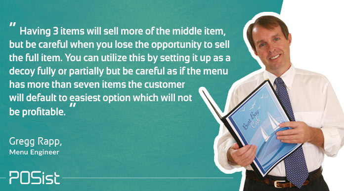
On the other hand, if a customer tends to think that for a slightly extra sum of money he can get a lot more food, he will go ahead and order the full dish. In both the scenarios it is a win for you! The small size option will push customers to medium and the medium size will push them to full serving.
6. Psychology of Colours
Colors play an important role in creating a restaurant menu design. Every color is known to instigate a different emotion in humans. Thus your choice of menu colors will determine how people will subconsciously feel about your food and restaurant. For a restaurant wanting to market its food as fresh and cool in a hot climate, the color green and blue is go-to options as they signify freshness and blue adds a tinge reminder of an ocean making it a perfect choice for a seafood restaurant.
The color orange is known to stimulate hunger while yellow makes a person feel happy. Red encourages diners to take a plunge, making it perfect for restaurants that are dealing with less mainstream food. Yellow and red work especially well for QSRs because of their lively nature while blues, deep reds or teals are good for fine dining. Theme restaurants fall in shades between the two extremes. Find out how colors impact the choices of customers while dining in a restaurant here.
7. Psychology of Pictures
Pictures, graphics or drawings whatever you choose, a visual aid can add great layers to your restaurant menu design. A study proves that pictures especially those that are eye level, instigate customers to order more. That being said reception and use of pictures is highly subjective. It is not a good idea to include too many pictures on your menu if you are a fine dining restaurant as it is somewhat associated with over-selling oneself. Thus clear graphics here and there work better. It is also better to highlight columns than use pictures for such restaurants but remember you can not go overboard with highlights as well. One or two per page is enough.
In QSRs customers usually want good food and are not paying for a dining experience. Thus using some well-clicked pictures gives customers an idea of what they are ordering and what to expect. Using pictures of high-profit items thus boosts their sales. Add us meal or decoys to that and your menu will automatically promote your sales.
All tips said and done, successful restaurant menu design will require insight and selection. Select what hack applies to your restaurant and carefully chose how to use them to design a menu that will work wonders.
Use this Restaurant Menu Engineering Checklist to create the perfect menu for your restaurant business that not only tempts customers to order more, but is also high on profits.








Can you give bullet points for psychological strategies used for the menu, along with creative menu content?
This is how restaurants trick the customers into ordering more 😛
Restaurant menu design psychology is something not many restaurant owners pay attention to but it certainly is a good way to entice people and have them order more.
Great article!
A restaurant’s menu is more than just a random list of dishes. It has likely been strategically tailored at the hands of a menu engineer or consultant to ensure it’s on-brand, easy to read, and most importantly, profitable. Great Read.