A restaurant logo generally reinforces the brand message and works as a symbol to illustrate the brand across all marketing platforms, and helps to bolster a restaurant’s marketing campaigns. Once you have the right restaurant logo in place, it can play an essential role in creating a band of loyal customers. However, creating a stellar restaurant logo, keeping in mind the various nitty-gritty, can be a daunting task.
Designing a restaurant logo is not an easy task, it is an art that may take years to master. However, considering that logos go a long way and help you to build your brand image, it is highly recommended that you take time and design one, that will do wonders for you!
Things to Consider While Designing a Restaurant Logo
Selecting a restaurant logo isn’t an easy task. There are a few necessary prerequisites that must be included if you want to craft that perfect restaurant logo for yourself. Confused about the things that you should give optimum importance? Read below to know more.
1. Differentiation
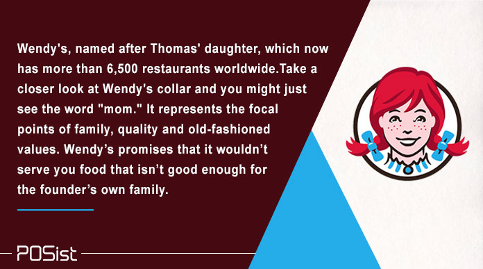
Your restaurant logo must convey why your restaurant is different from others in the market. An excellent restaurant logo must have a distinct personality, and it should reflect on their service and product. For example, Wendy’s, named after Thomas’ daughter, which now has more than 6,500 restaurants worldwide. Take a closer look at Wendy’s collar, and you might see the word “mom.” It represents the focal points of family, quality and old-fashioned values. Wendy’s promises that it wouldn’t serve you food that isn’t good enough for the founder’s own family.
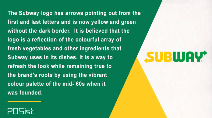
The new Subway logo, the word “Subway” has arrows pointing out from the first and last letters, is now yellow and green without the dark border. It is believed that the logo is a reflection of the colorful array of fresh vegetables and other ingredients that Subway uses in its dishes. The color yellow-green is a way to refresh the look while remaining true to the brand’s roots by using the vibrant color palette of the mid-’60s when it was founded.
This shows that your restaurant logo must be different from the others in the market, and at the same time, it should tell what you are selling and how you are different.
2. The Restaurant Logo Doesn’t Necessarily Have to be a Symbol
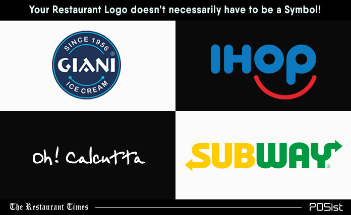
It is often presumed that a perfect restaurant logo has to be a symbol. However, this is not a compulsion. Your logo can even be the name of your restaurant as well. There are multiple stellar restaurant logos on the market which merely carries the name of the restaurant in the simplest way possible. For example, IHOP, Subway, Giani’s and Oh! Calcutta, they use letters with no logomark. Keeping that in mind, try to create unique lettering that makes your business name pop. Also, remember while designing a restaurant logo, that the font you use must be in tune with the tone of your restaurant. For example, a fancy script doesn’t fit a takeaway or a quick-service restaurant.
With the intention of making it as creative as possible, don’t go over the top. Even if you use a logo designer to create a mock-up, add simple touches that will be in sink with your brand story. For example, think about the arrows at the end of the “S” and “Y” in Subway. They add the perfect finish to a simple design.
4. Balanced Shapes
In the attempt to be exciting try not to go crazy throwing strange elements together. A cluttered logo generally confuses customers and doesn’t leave a good impression on them.
Hence, it is recommended you use familiar and simpler shapes and proportions in a restaurant logo. A good restaurant logo can be broken down into circles, rectangles, triangles, and squares.
While there’s nothing wrong with mixing round and sharp shapes, but you need strong symmetry for a clean logo design. Keep in mind, and symmetry doesn’t mean both sides of the logo have to look exactly the same. The important thing is to control the amount of space used throughout the design.
3. Your Restaurant Logo Should tell a Story
Just like your restaurant name your restaurant logo should ideally have a story. The story can depict the circumstances that prompted you to start a restaurant or what you want to achieve through your restaurant. Once customers know about your story, then they will be able to relate to it, and it will bring them much closer to your restaurant.
Cracker Barrel is a well-known brand now, and however, originally it was a country store in Tennessee. Its logo captures the picturesque history, pristinely depicting a man and a barrel in the front of an old store. Everything about the restaurant’s logo narrates a story of the Southern comfort and hospitality.
5. Symmetric Colors
Colors have a lasting impression on your customers. Choose your colors as per the format of your restaurant. For example, if you have a fine dine, it is recommended for you to use colors which are necessary, instead of using vibrant colors which might be just apt for a QSR or a takeaway outlet. In addition to this, red, orange and yellow are vibrant colors, and they are apt for fast food restaurants. These colors channel feelings of joy, desire, speed, and celebration.
Use colors with which your customers will be able to relate to. For example, many of the Italian restaurants use red or green in their logos, because they are the main colors of the Italian flag.
If you think that you will have to fill in every space in your logo with colors, then you are wrong! White space gives your eyes a break and takes your attention to the secondary elements. Keeping while spaces make a restaurant logo look more crisp and refined. For example, Pizza Hut lettering appears to float in the white space, which tends to attract a lot of eyes.
6. Your Restaurant Logo Should be Simple
It takes longer to design a stellar restaurant logo. Don’t be in a hurry! Do and then re-do if needed be. Keep editing until all unnecessary elements are removed. Make it as simple and as easily understandable as possible. Remember, a customer will not and do not have the time to analyze your logo. Hence, make that first impression count.
Once you have done designing that stellar restaurant logo, take recommendations from all your wellwishers. Having a well-designed logo in place will make half your work done. Your logo will talk and will help in attracting and retaining customers while building the brand image further. Hence, what are you waiting for? Follow the tips mentioned above and see how your logo does wonders for your restaurant brand!


