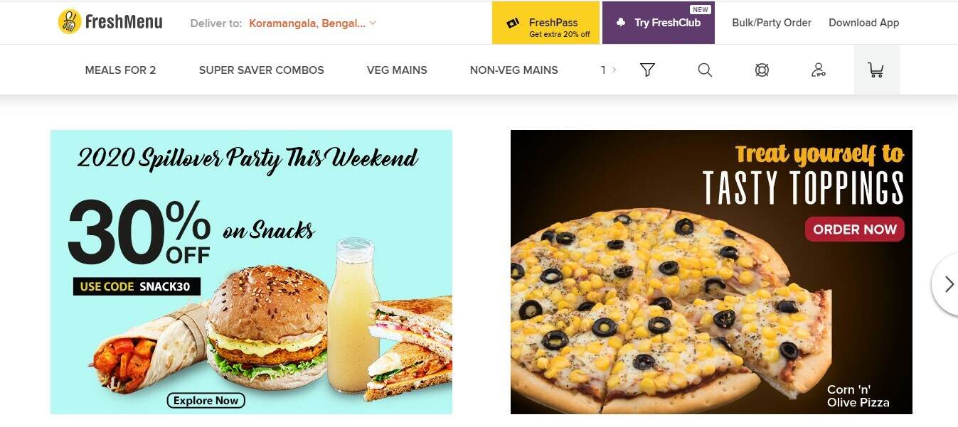
The last decade has seen an overwhelming revolution take place in the F&B industry. Not just in terms of the revenue generated by the industry, but in the way consumers think about food. A new survey from MGH suggests that 77% diners visit a restaurant’s website before deciding whether to dine in or order take away. Contemplating growth, restaurateurs are trying their best to be present where the majority of customers are: Online! Having an online presence, be it your restaurant website, blog or social media, has become extremely crucial for growing a community of followers. To increase user engagement and a restaurant website needs to be able to reflect the uniqueness of your brand, more than anything.
In this, we bring you some awesome restaurant websites that would inspire you to create one for yourself or make it even better!
Visually Appealing Restaurant Websites To Take Inspiration From- For Different Restaurant Format
What you need to keep in mind is the theme of your restaurant. Different restaurant formats focus on various operations concepts to be successful. This is why, their outcomes for being present online are different. For instance, a QSR would want to create more sales by increasing the number of orders it gets. The customer is therefore attracted with incredible combo offers or bright colored menus with images of fast selling dishes.
On the other hand, a fine dining restaurant’s website might target more leads or reservations. The significant difference here between the two kinds of restaurant formats is the ticket price. As a restaurateur, identify your marketing objective for your website. Once you decide that, you need to finalize the look or theme that will make it standout.
Simplifying the process for you, we have curated some examples of aesthetically designed restaurant websites by category. Here you go!
1. Fine Dinings
As mentioned earlier, fine dining restaurants target more reservations to stay profitable.
Since they do not work on a takeaway basis, their websites focus on drawing the customers attention to the ambience and overall vibe of the restaurant.
Let’s take you through a few examples!
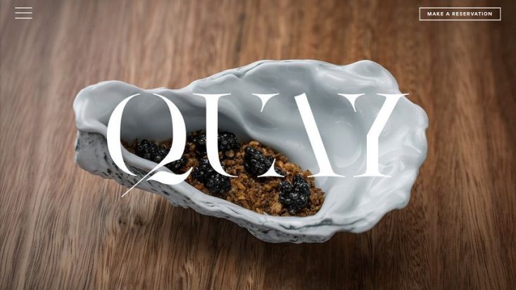
i) Quay (Sydney, Australia)
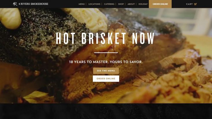
ii) 4 Rivers Smokehouse
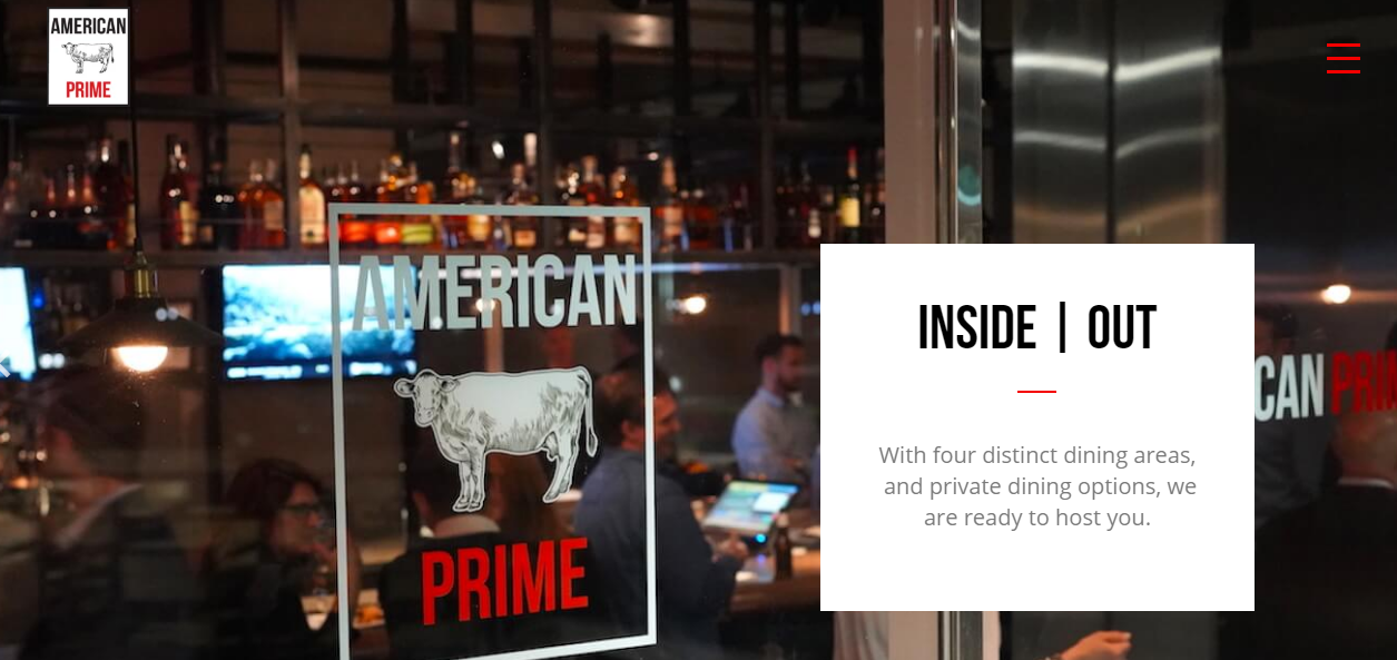
iii) American Prime Steakhouse
2. QSR
Next on the list, a QSR might want to appeal to a certain demographic like youth and families.
On the other hand, things are slightly different for a large QSR chain.
They might want to increase their retention figures and accordingly might focus on engagement pitches such as ‘make-your-own-pizza’ or happy hour; they need much more detailed planning to make an impact with their intended audience. Let’s look at both independent and restaurant chains for a QSR format!
i) Standalone
Here are two examples of simple yet impactful standalone QSR websites that you should check out!
-
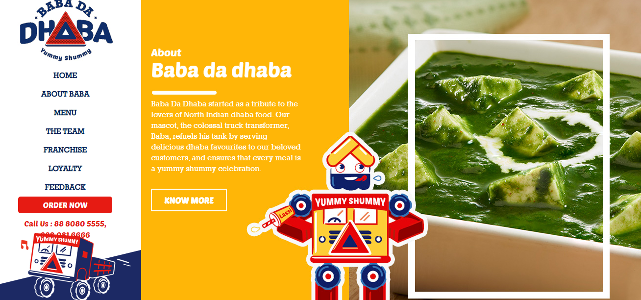
Baba da Dhaba
-
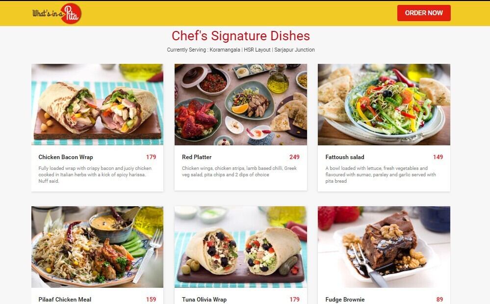
What’s in a pita
ii) Chains
Since the business model is entirely different for restaurant chains, a QSR chain website needs to highlight the features specific to a region or country. The primary focus is always sales and revenues. Generally, online sales and delivery is the primary source of revenue generation for a QSR chain.
This is why, showcasing customized meal options, including health food is sure to attract customers who are conscious of eating right.
Here are a few examples of the positioning adopted by massive QSR chains!
-
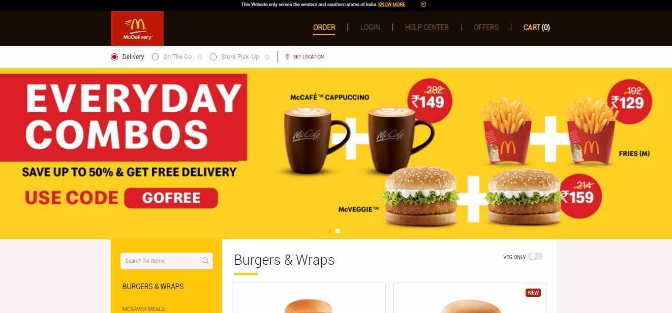
Mc Donald’s
-
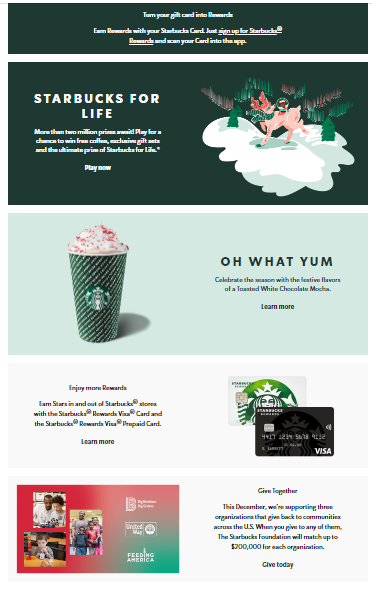
Starbucks
One of the first things that a user notices about Starbuck’s website is the loyalty program of the brand.
For a successful QSR chain, your customers need to keep coming back and refer others. The website focuses on referral and loyalty programs. Along with the loyalty programs, it lets customers know how to burn the points they have earned!
Moreover, the classic white theme of the website is both appealing and subtle. A little touch of green (color of the brand) gives the site a fresh look. The menu section is well divided into categories, easing the decision-making process for a customer.
-
Belgian Waffle
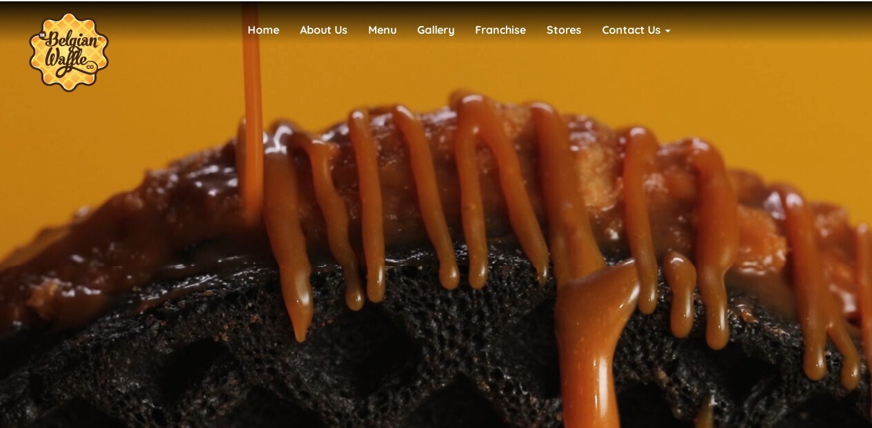
We loved what Belgian Waffle has done with their website. The first page itself tempts the customer into exploring the site further. The stellar video content, along with GIFs combined with the yellow theme color, makes everything about the brand look mesmerizing.
3. Casual Dinings
Let’s look at a few examples below:
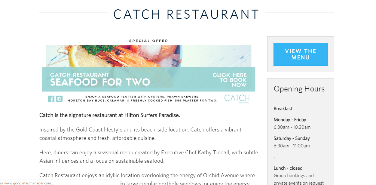
i) Catch (Australia)
The overall look and feel of the website create an impression of luxury. The top features of the site include dedicated pages for different teams, a section for the chef, and a separate section for event planning and organization.
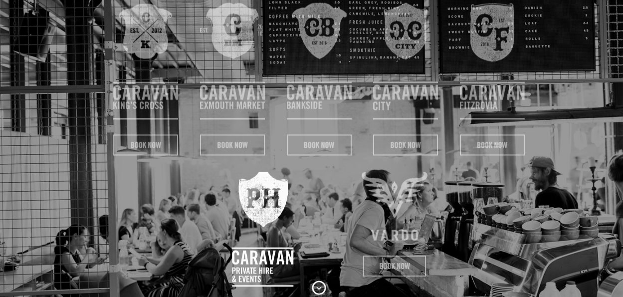
ii) Caravan
4. Bakeries
While creating a bakery website, you have the undue advantage of better visuals and more ways to attract a sweet tooth towards the brand. What you need to focus on is the type of business model you’re running.
Your website should focus on your business niche, and thereby highlight your bestsellers, like wedding cakes, bread, organic dishes, etc. In cases where a baker also wants to sell his bakery products on his website, he needs to have his website highlight the e-commerce section as well.
Here is an example of the same!
i) La Pierre Qui Tourne
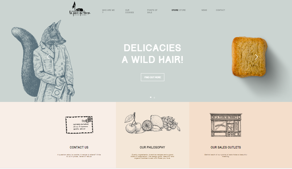
A fantastic example of a well designed bakery website is La Pierre’s. The website uses art and illustrations instead of icons and pictures to create an ideal user experience that is quirky and inviting. Along with that, the simple matte shades of the site add up to its charm. The primary focus of the website is to increase engagement and position itself as a premium brand. This is why,it’s minimalist layout is in stark contrast to brightly colored web pages. It gets it chique factor due to the use of color in select places, immediately drawing the eye. In case you have a similar business model, your inspiration is right here!
5. Bars and Pubs
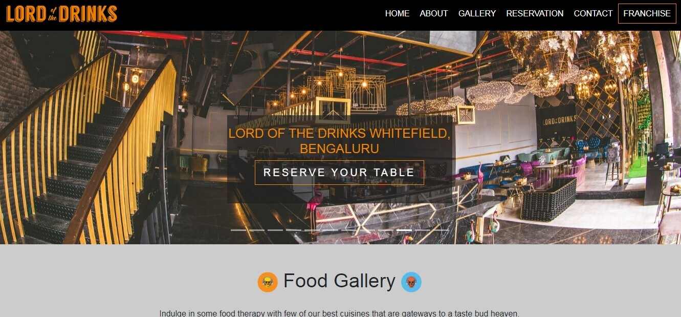
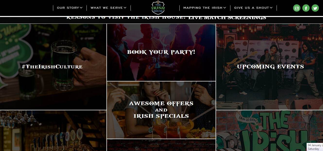
Restaurants that serve liquor focus on achieving more footfall and hosting successful events. Since everyday is a party at a restrobar, the measure of success depends on the number of people engaging in an organized activity.
The primary focus of a bar or pub website is table reservations. This is why, your home page should create urgency among your customers to book a table!
Here are a few examples of how bars and pubs engaged with the customers through their website.
i) Lord Of The Drinks
ii) The Irish House
6. Cloud Kitchens
With a different business model altogether, a cloud kitchen restaurant website is the only platform where its customers can check out the brand. The absence of a physical store or outlet makes it the virtual storefront where customers connect with a cloud kitchen brand.
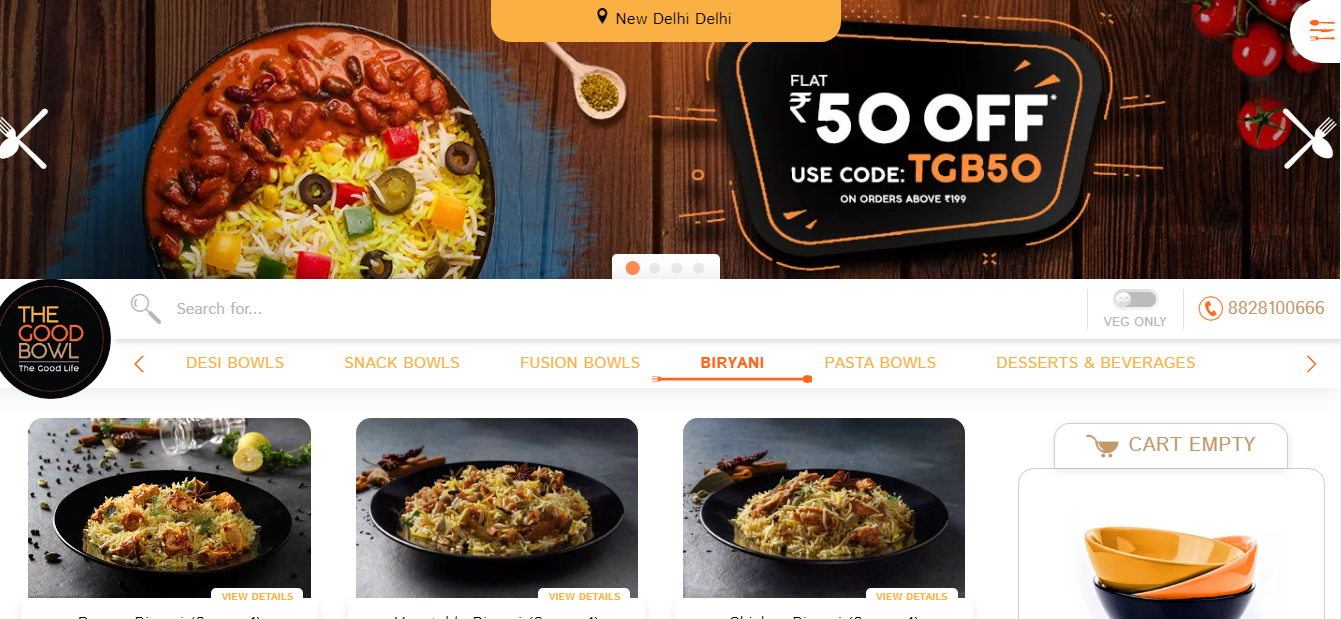
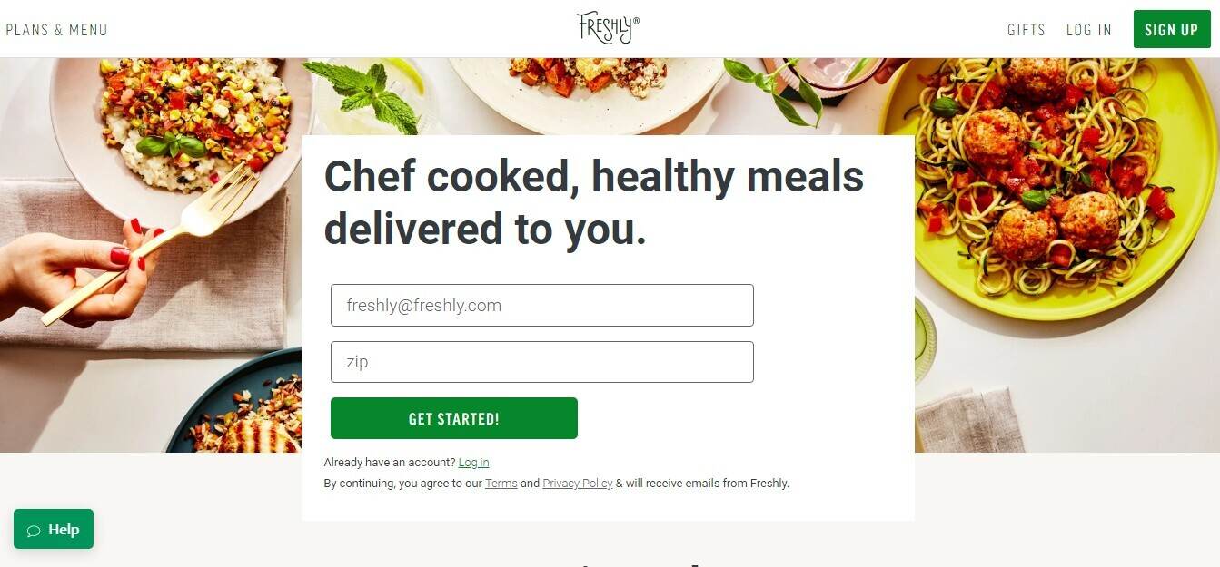
Considering the unique needs of this format, a cloud kitchen website needs to be self-explanatory, should have a story section where people can read about what the brand does and another dedicated section that focuses on order taking and delivery.
Features required in a cloud kitchen website!
- Capturing the location details of the customer is one of the prime needs of a cloud kitchen website. Therefore, the area prompting bar should be right in the center of the home page.
- Next comes the ease of navigation of the website. Customers need to be able to look at the entire menu easily without getting confused among the dishes.
- The menu section must also showcase your bestsellers, your chef’s choices, and weekly specials, or offers that you’re currently running clearly on the website. It must have a buy-now button as well as in-built chat options.
- The next most important feature is the check out area. You need to minimize the steps taken to place an order to avoid high cart abandonment rates.
Here are a few brilliant examples of cloud kitchen websites, for you to take some inspiration from!
i) The Good Bowl
ii) Freshly
7. Food Trucks/ Food Courts
The target customer persona for food trucks or food courts is a city dweller who is always in a hurry. Incoming food trucks made it possible for the customers to have their breakfast on the go! That said, customers would never want to compromise on the taste and quality of the food.
Here are some examples where the website itself makes you want to order food right away!
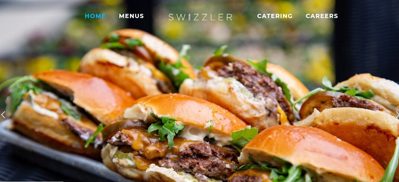
i) Swizzler
The vivid color scheme and the appetizing pictures go well with the theme of the brand. The website has a red and white color scheme, making it look more jazzy and worky. Since food trucks are majorly for people who do not have enough time to dine in, the website gives you all the information you need to order instantly and get on with your tasks.
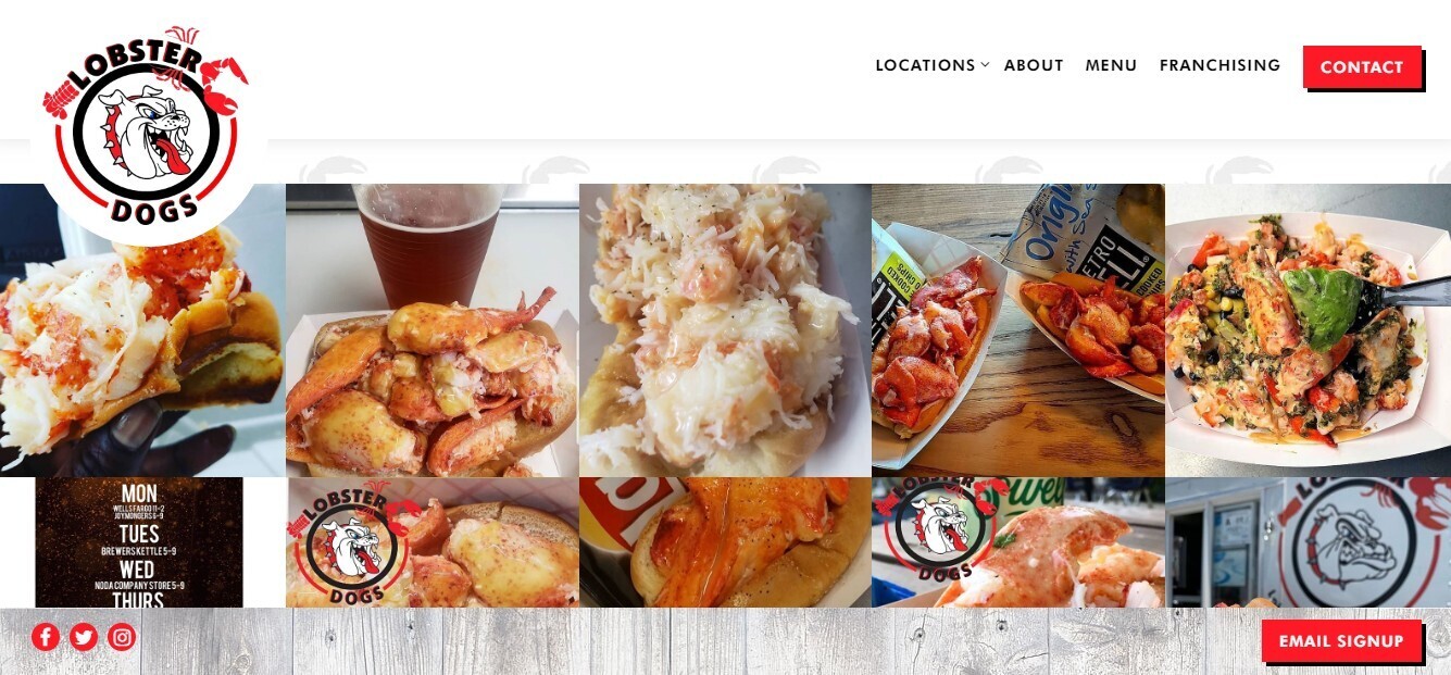
ii) Lobster Dogs
8. Pizza Shops
A type of QSR, pizza shops, also focus on increasing takeaway orders.
A pizza shop website needs to focus on any unique aspect that its products may have in terms of preparation or delivery Any special deals and combos that the brand has in store for the customers must also be prominently displayed. The home page should look something like this.
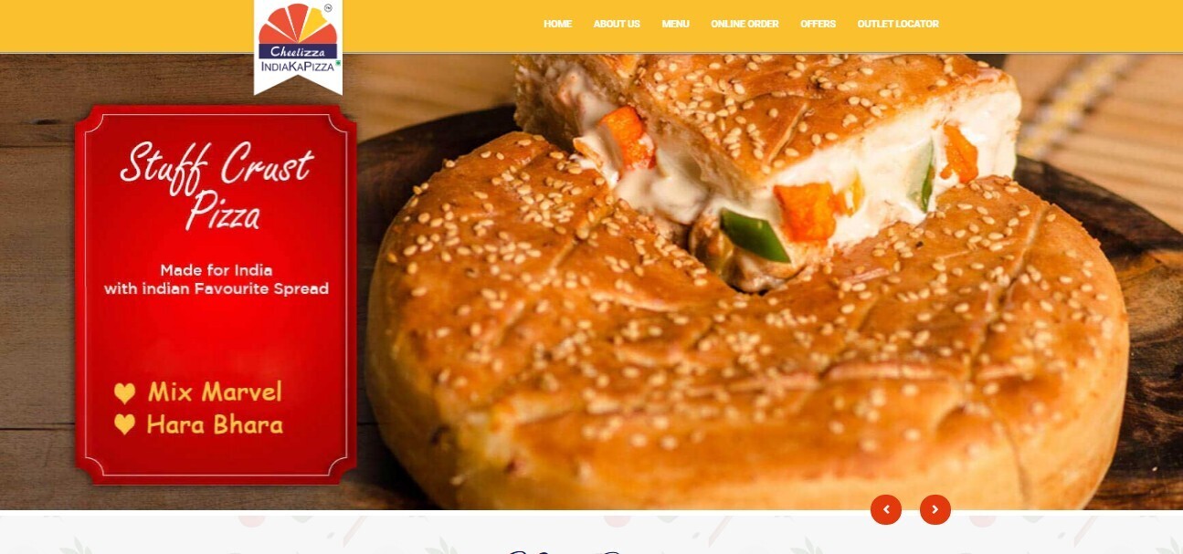
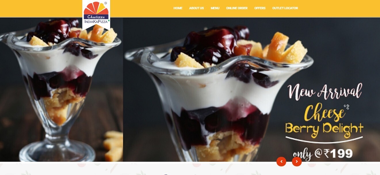
i) Cheelizza
Navigating through the website, you can see how well they divided their categories to make it easy for the customers. Everything from the choice of color scheme, to the layout, fits perfectly for this one!
The major attraction of this website is its food pictures. Showcasing the unique dishes of the brand, the restaurant website mentions several deals and offers on the home page itself.
9. Coffee Shops/ Cafe
Convenient and quirky, cafes or coffee shops have a warm vibe at their outlets.
Customers coming into a cafe want to enjoy the interiors and enjoy a refreshing cup of coffee, all at affordable rates. Therefore, a website for a cafe needs to convey the unique story on which your cafe is based.
Many times, talking about how your in-house coffee is different from the rest of the brands works well for the restaurants.
Let’s look at some famous examples!
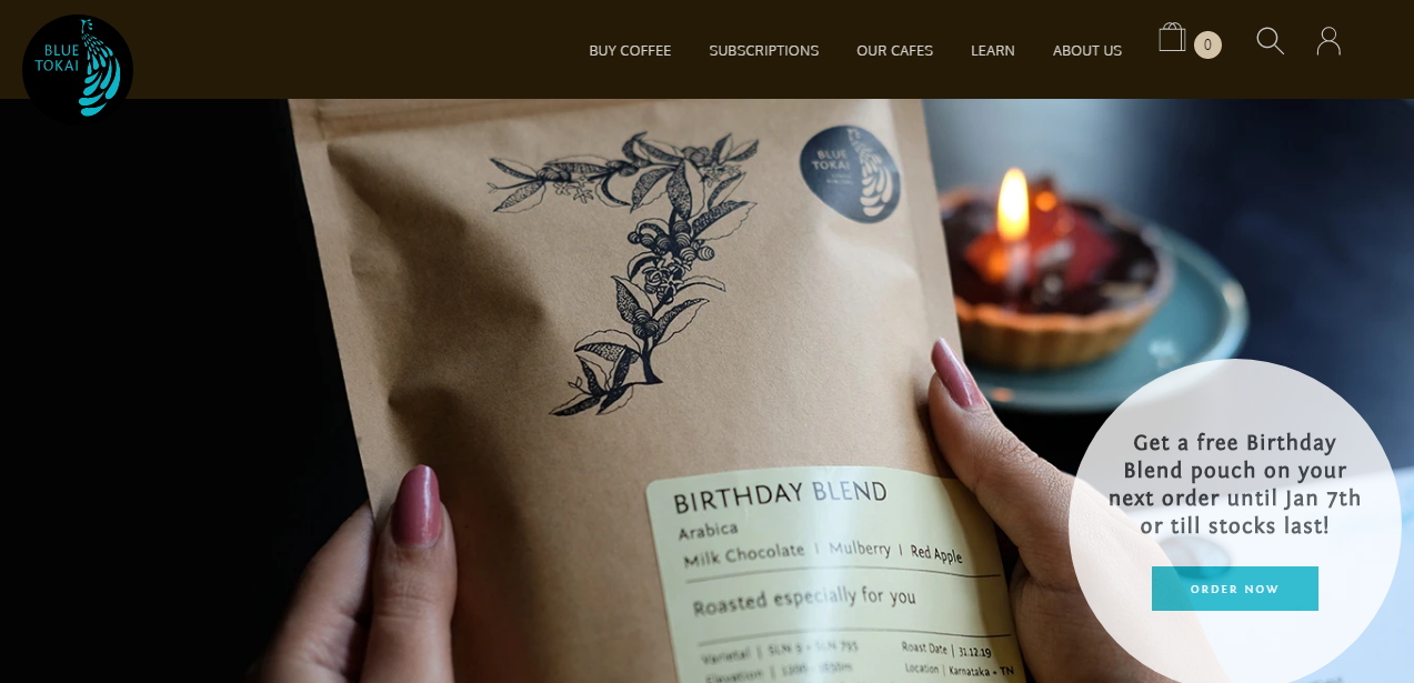
i) Blue Tokai Coffee Roasters
Blue Tokai Coffee Roasters is considered to be one of the most beautiful coffee places in the capital city of India. With the best possible location, the so-called coffee bar has a fantastic restaurant website to attract its customers. The theme colors and high-quality visuals do proper justice to its name. One peculiar feature of the site is the ‘About Us’ section, where they have beautifully presented their brand story, about what they do, including a small video clip of how they make their coffee.
All in all, your restaurant website is often the first impression of your brand that your customers get. Keep the presentation and layout of your text simple and build an engaging homepage to avoid any confusion for your customers. Since most of your customers check your website before choosing your food, you must present the best possible version of your brand to the customers.


