Your restaurant food menu, when designed well, can be so much more than just a list of items which you offer at your restaurant. Your food menu, in fact, is the biggest tool in your arsenal which you can use to garner high profits. Menu engineers design menus with a certain level of marketability in mind to ensure certain dishes sell.
The Restaurant industry is an especially competitive market when it comes to Dubai and other Emirates. Tourism is high, customer count is high but so is competition. Keeping that into perspective it is interesting to note that while high levels of competition which subsequently lower restaurant profits are a problem everywhere, in Dubai and other Emirates, this problem is especially huge. Thus comes the role of a food menu. Here are some great menu designing tips that will help you in creating an attractive menu.
What Is Food Menu Designing?
Food menu designing or menu designing, in general, is the art of designing a restaurant menu in such a way that selected dishes to have the highest selling rate in order to increase the overall sales of the restaurant. It encompasses a variety of techniques which must be combined and used together in order to elevate customer experience, increase sales, decrease or increase table turnover time, push the customer to order the right dishes, etc in order to garner the highest profit possible, all through menu design.
Food menu designing is different from food menu engineering because the latter comprises of pricing the menu and only structuring it for higher profitability.
Why Food Menu Designing Important For Your Restaurant
Food menu design is a very important part of your restaurant marketing operations. Your menu is the CV of your restaurant and not having a well-designed menu would mean that you are failing at the core of your restaurant marketing strategy. This is so because no matter who the diner is, he/she is going to look through your menu and decide what they want to eat. This means that your food menu is the primary factors that influence your customers’ order and how much.
The whole point of food menu design is to garner the highest possible profits and those will come only from the sale of the right dishes. Menu designing is an effort towards pushing the customers to order only the highest profit dishes in a restaurant so that high profit generating items are sold as much as possible and the least possible number of customers default to the basic dishes. How the items are placed, where they are placed, how many are placed, what font is used, what spacing is used, how the price is hidden are all factors working together to upsell the correct dishes.
How to Design a High-Profit Food Menu for Your Restaurant
Now that you are well aware of what menu engineering is and why food menu design is so important, next comes how to engineer a menu. To do so here are some techniques that you must know and some tips that you need to follow.
1. Using The Right Font
The first and foremost aspect of menu designing is the font. You need to pick your font carefully with your establishment, your brand image, your theme and your target audience in mind. The font must not be too boring and simple but not so complex that it seems impossible to read, too quirky, or way out of the box. If you are a fine dining restaurant, you will need a font that is smart, classy and not too loud. For a beach shack, on the other hand, something more casual would be better.
2. Using The Right Font Size
Once the font is decided, then comes the value of font size in your food menu design. The correct font and font size lay the groundwork around which your menu can be formatted and menu design created. If the font size is too big, it might end up taking a lot of space or make the menu cluttered. If there are less than eight items on the menu page, you could go with a large font size; anything between 8-12 px should be good enough. If there are more items on the page, you can go for a small font. However, don’t keep the font size lower than 12 px as it would make the menu difficult to read.
3. The Colour Of Your Menu
The next factor in your restaurant menu design is the color. You must choose the color of your restaurant menu carefully and after much deliberation. Not only should it match the theme of your restaurant, but also instigate the correct emotions in the customer. Every color subconsciously affects our psyche. That is why colors must be judiciously used.
There are certain colors like reds and yellows which stimulate diet and makes people order more impulsively. On the other hand, colors like blues are diet suppressants as they put people in a more relaxed mood. At the same time, these colors cannot just be used regardless of the format or style of your restaurant. While it is true that reds and yellows stimulate diet, they are better suited to QSRs where impulse buying and high table turnover rate is important. Fine dines earn more out of customers that stay for longer durations than those who just dine and eat. Deeper shades, more subtle colors and rather neutral combinations are used in fine dines while bright colors which attract attention are good for QSRs.
The point of food menu color is to put your customers in a certain mood so that their purchase decisions are impacted.
4. The Size Of Your Menu
Next is the size of your restaurant menu. No one wants to flip through pages of a menu without any categories they can simply choose from. Long menus are confusing, do not interest the consumer and simply do not generate profits. It is also difficult to maintain the inventory for a large menu.
Having a separate food menu and drinks menu is a good move. You can even go for seasonal menus. Reducing the size of individual menus will make them easier for the customer to read and for you to design.
5. The Size Of Each Menu Category
Just like the size of the menu, the size of each and every menu category is also just as important. If you have too many options listed under the same category, your customers will simply default to the most basic item. The most basic items on your food menu will rarely be your most profitable items. Thus, the need to know how much to place under each category is important even before pricing these dishes and other menu engineering techniques come into play. The idea is to not put more than 7-10 dishes under any category in your food menu.
6. Tapping the Right Menu Spots
Did you know that there are certain spots in a menu that you subconsciously pay more attention? Then there are those which you do not even look at. The key is to place your highest profit dishes in these spots so their chances of getting order increase. The top right-hand corner, the bottom left corner, and the middle together make the ‘The Golden Triangle’. This is where you either set-top profit items.
The golden triangle of restaurant menu design is the middle of the menu from where the customer’s eye travels to top right corner from where it ultimately settles to the top left corner.
7. Writing Prices
Prices need to be written with the utmost care. This is so because even if you have done everything perfectly if you write the prices in a wrong manner, the whole menu design could go flat. The first thing to know regarding writing menus is that you must not line the menu items to the prices. Lining the menu forces the customer’s eyes to travel to the prices and they end up choosing the cheapest dishes on the menu.
Another important menu design top is to not list the prices at all. An ideal way to write prices is to write them next to the menu description in the same font so it garners as little attention as possible.
8. Setting Decoys
This is a highly used food menu engineering tool. A decoy is basically a very expensive dish which may be no one would buy, but the purpose to keep it on the menu is that it makes all the other menu items feel comparatively cheaper. Usually, these decoys are purposely placed in a key menu spot or in a highlight so that other high profit yet expensive dishes can move faster.
9. Using Pictures
Pictures in a menu and whether to use them or not have been a topic of debate for a very long time. While it is true that including pictures does enrich a menu, in the age where this tool has been overused, the wrong pictures or the wrong amount of pictures can make the menu look cheap. Pictures should be kept as at bay a possible for fine dines. This is so because they add a casual air to the menu which mostly does not go with the theme. For casual dines, slight use of pictures is recommended while for beach shacks and QSRs, pictures are a tool that they must incorporate in their restaurant menu design. using pictures on the menu is an effective menu design tip.
10. Writing Tempting Descriptions
Well written menu descriptions have the power to sell and upsell your items by themselves. A great menu description is ideally one that tells the story behind the food, evokes the senses while recounting the ingredients and the process of creating the dish. Keep the descriptions short yet appetizing, and highlight the USP of the dish that tempts customers to order the item.
11. Highlights
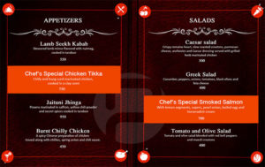
The final food menu design tool is highlighting specific menu items. This can be done by putting them in a box or adding a separate dash of color. Highlights draw the customer’s attention to themselves and can be used well in combination with decoys. Remember that the highlights must also be well spaced and balanced or else hey will fail to work.
Use this Restaurant Menu Engineering checklist to ensure that your menu is high on profits.
The restaurant industry is an especially tough nut to crack, and restaurant menus, though may seem rather unimportant when compared to all the other areas you need to pay attention to, must not be undervalued. Follow these effective menu design tips to create a restaurant food menu that will definitely garner more sales and increase your profit!









It’s a very detailed article, can you explain me the importance of description in the menu and how can I use it?
I want to see samples of menu .