A menu is the most underrated but one of the most essential parts of the restaurant experience. Just like restaurant interiors, the restaurant menu affects a customer’s psyche, and subconsciously the customer judges the restaurant and the food based on the menu. A menu can be considered the CV of a restaurant, which makes the restaurant menu design crucial to any restaurateur. According to a study, a customer spends only 109 seconds reading the restaurant menu before deciding what to buy. This is the only window that you have in which you can either push the customers to your highest profit dish or make them default to the most basic dishes. There is no midway. In a country like UAE, which runs on tourism and a variety of customers, and especially in economies like Dubai and Abu Dhabi, restaurant menu design becomes even more crucial and just as challenging to pull off because of the competition around. Here are some useful restaurant menu design tips!
Restaurant Menu Design Tips to Create a Selling Menu
As said earlier, restaurant menu design plays a crucial role in pushing the customers to order your best dishes. This is important for not merely your profits but for customer experience as well. The easier a menu to read through and order from, the better the customers find the restaurant and the entire dining experience. Here we have for you some restaurant menu design tips that you can employ to push your customers to the right dishes.
1. Be Unique To Your Concept
Looking at your competition and getting inspired is one thing, copy-pasting their menu format is another. Remember that the menu is an extension of your restaurant, and the restaurant menu design is an extension of the vision that you have for your restaurant. You know best what the menu is supposed to make the customer feel, how they should react to it, and how creative you want to get with it.
Your menu design while talking about your restaurant and your restaurant concept through its format, colors, graphics even touch and feel so the first tip will be to get on the drawing board and list down exactly what the menu must represent and then get down to the technicalities of the designing it.
In the UAE, there are more restaurants than anywhere else in the world. With such a high level of competition, creativity is necessary, and being unique to your concept and not being unique for the heck of it are important parameters which will reflect on your restaurant menu design. An effective menu design should include your restaurant’s unique USPs.
2. Mind The Colours
The one thing that people judge the most subconsciously and base all their future judgments on is the use of color. This fact stays true for the menu as well. According to color psychology, colors instigate emotions in us which make us judge something positively or negatively.
While this happens on a very personal level, our choices for colors are also an effect of our socio-cultural molding. This is problematic when it comes to designing a menu, especially since the UAE runs heavily on tourism. The restaurant business there does not have too huge an audience at home, making choosing the correct colors for the restaurant menu design a more critical task.
Our tip is to keep the colors as subtle, deep, and non-flashy as possible. Reds and Yellows which are appetite instigators are ideal for QSRs. As for others, deeper versions of the same shades should be considered. Flashy colors are a strict no for fine dines. In fine dining, major earnings come not from table turnovers but from customers ordering more on the same table. For this, you need to put them in a relaxed mood and make them linger. Shades like deep blues or subtle gold and beige do so very well. Though blue is considered an appetite suppressant, it’s deeper versions are still used in fine dines extensively for this very reason.
3. Use Appetising Pictures
Pictures follow a debate similar to colors, no one knows the right amount but put too little of them and the menu design will not be perfect, but too much of them and the customers may get a negative perception of your restaurant. The best course of action is to use pictures sparingly but putting them correctly.
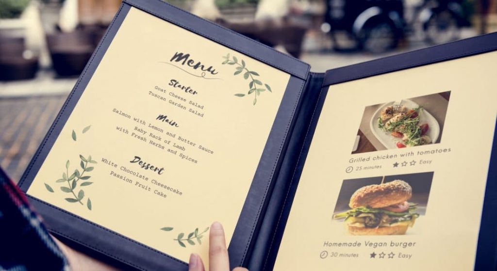
Do not use more than one or maximum of two pictures on a single page. Use the pictures of your own dishes and write a description for them as well. Pictures should ideally be used to highlight some dishes so use them for your specialties only. Adding pictures is one of the most effective menu design ideas.
3. Be Informative
The trend is moving towards people wanting to know what they are eating. Your restaurant menu now just does not have to be creative but in bounds of that creativity, it now requires to be informative as well. Give as much information as you can about the dish without making the menu description too long.
Highlight the backstory of an ingredient or if there is something which makes a dish unique, tell the customer’s about it. If they think that there is something special about a particular dish, they will be intrigued to order it. Letting out pieces of information in a not stuffy or pushy way is good for your restaurant menu.
4. Use Simple Language While Writing Menu Descriptions
While we are on the point of writing the menu and menu descriptions, another thing to keep in mind is the language that you use to write your menu. Make sure that your sentences are short and simple to understand. The language should not be complicated or even difficult. Stay away from industry jargon as much as possible.
Do not complicate the menu, since the window of order that you have is already too small. If the customer cannot understand the menu, they will only get irritated and ask for the most basic dish without a second thought. That fails the effort behind your entire restaurant menu design.
Here is how you can write mouth-watering menu descriptions.
5. Highlight the High-Profit Items
The next tip is to highlight. At the end of the day, if you put something in a box, the box attracts attention. At the same time, it breaks the monotony of format and gives it a pleasant variation. That is how highlighting works. Strategic highlights on your menu can push the customers to some specific dishes while breaking the monotony of the menu thus increasing its design value.
You can either highlight your specials or even set up decoys in the highlight. Decoys are dishes that are priced extensively high to make the other high-profit dishes on your menu look cheaper. When the customer looks at a decoy, he/she sets the price in their head, then all the other high priced and high-profit dishes seem relatively cheaper which pushes the customer to order them as they lie or the customer in a medium range.
6. On Writing The Price List
The next crucial part of your restaurant menu design is how to write prices. Writing prices with the currency sign prompt the customer to skim through the price list and then order the cheapest item. Dotting your menu and joining the name of the dish and its price with dots does the same thing. Prices should be written in the same font as the rest of the menu next to the dish’s menu description. While it should be neat and comprehensible, it should not attract the diners’ attention. Decoy prices should also be written in the same way as regular prices or else it will break the format.
7. Have Separate or Divided Menus
The length of your menu is also an important feature of your restaurant menu design. If the menu is too long, the customers will either not bother too much or get very confused with all the options available. In both cases, the result will be the same, the customer will default to the most basic menu item available. The solution to this problem is to either have separate menus or to divide the menu.
Separate menus work best with desserts or drinks. Having a separate drinks menu will let your customers order food and drinks as two different units. It will also prompt them to order more. The same goes for a separate dessert menu. If you plan to have a divided menu instead, make sure that your categories are based on a common quality of the dishes and each division does not have more than ten items.
Always place the drinks before appetizers and desserts at the end since that is how a meal goes as well. You can have further divisions in the basic drinks, appetizers, main course and dessert divisions as well based on ingredients, for example, you can have a separate division of or even an entirely separate seafood menu.
Make sure that even after the divisions, the menu is neat, clean, and easy to understand. Do not clutter the menu even if that is what your theme is based on. Remember, there is a difference between a mess and an organized mess!
8. Keep Your Target Audience In Mind
While designing your menu, keep your target audience in mind. That will solve half your problems. If you know who you are serving, you will be able to make decisions like what color to use, which pictures to put, etc better. Another major reason that you should consider who your target audience is, especially the age of the target audience is to decide the font of the menu.
No matter how well placed your dishes, precise your highlights, and consistent your format, all of it goes to waste if the customer can not read the menu with ease. Creating contrast on the menu is one way to ensure readability but even that will take you so far if you do not know the correct font size or style. That is where the target audience or more precisely the age of your target audience comes in to play.
If you have a typically older target group, you need a font that is larger, still fits in the symmetry of your menu design, is not too overpowering for the customers, and does not look or feel too relaxed or childish. On the other hand, if your target audience is a younger more internet exposed generation, you can be experimental with the font you choose and the way in which you write. Seek restaurant menu design inspiration from your target group, this will help you in catering to them better.
9. Proofread
Finally, one of the last restaurant menu design tips that can not be stressed enough is that you must proofread your restaurant menu. Having a perfectly designed menu and then looking at a customer point to a spelling mistake in it is anything but a sign of a well-designed restaurant menu. Make sure that your menu is free of any typos, spacing or formatting issues, color issues, or any such lags.
Your restaurant menu design may not grab attention for all the work it does, but truth be told it is crucial to your restaurant’s profits. Your restaurant sells its dishes because of the menu and the menu can do a good job because of the way it has been designed. Follow these restaurant menu design tips and you will definitely see the results!


